
5 UX rule every software founder should know about
- Jan 26, 2020
- 5 min read
Updated: Sep 4, 2025
I’ve found that in my chats with founders I keep coming to some common themes. And it doesn’t matter if the founder has been working on technology all his life or if he has no idea about software. One of those common themes is the discussion about how to make decisions about the actual user interface of the features that she has been dreaming up.
For the technically minded founder it becomes a thing of do I use this pattern or that, or a strong bias of of some type (e.g. “less is more”, “pop ups are banned”, or something along those lines) and for the non technical founder it’s usually a more dangerous situation of absolute certainty about how the feature should be (usually with at least 20 buttons and a lot of color).

The recurring theme follows a common script where we listen to the instructions, we try suggesting some changes and are met with strong opposition and sometimes dismay and we then suggest we draw this up (hoping that we might tweak things during that process). In most cases at some point we can convince the founder to have an open mind and make decisions about the user interface and interaction based on a rationale and sometimes also a debate.
I used to point everyone to my favorite Alan Cooper’s About Face, it’s one of those books that equally valuable to the professionals as it’s to someone with a passing interest in UX. But now I find it easier to point to the amazing https://goodui.org/ as first step about thinking about patterns and rules of thumb in UI/UX (probably a sign that many of our new founders are from a generation that is more used to online content, quick reads and youtube).
Over the years, there are some UX wisdom that kind of made sense the moment we shared them with someone who didn’t know about them (or someone who knew but just haven’t thought about that for a while). These “instant hits” are really good to keep in mind when you are thinking about software interfaces but they are equally good to impress someone over a drink! So I thought it would be a good idea to do a quick and easy list of great UX wisdom today. Here’s my list of 5 of the easiest (and probably greatest too):
1. Fitt’s Law - larger and closer click-ability is better
Simple and logical rule of thumb which says you should always make the clickables (buttons, links, menus, etc.) large and close to where your mouse is currently. It’s so strong and has so much data to support it that it’s a “law” ! To implement Fitt’s law here are the two simple things you have to remember:
Most used UI elements should be on the edges of the screen. Because the cursor automatically stops at the edges, they will be easier to click on.
Make clickable areas as large as possible. Larger targets are easier to click on.
Fitt’s law is why tapping on those bigger commonly used buttons at the bottom of the iphone screen (where your thumb is) is so satisfying.


2. Hide your “ejector seat lever”
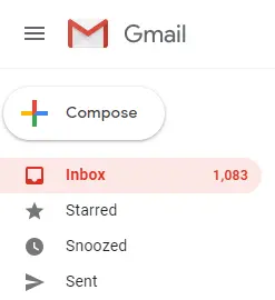
This one is from Alan Cooper. Again, very simple, you would never put the ejector seat lever button which ejects the pilot from a plane next to a common thing like light switch - just because accidents might happen. Same in software, don’t put major decision action elements (aka… buttons e.g.) next to and in similar level as other lesser ones. See how gmail keeps the trash option far away from the others and make the send button significantly different it’s neighbors? Great job.
Here’s the section from the man himself. If you haven’t got this book, buy it, if you have anything to do with software you should treat this as your religious text.


By Alan Cooper, Robert Reimann, David Cronin, Christopher Noessel
3. Fewer is always better
Not sure if there is “pattern” with that exact wording, but there are many patterns and rules of thumb that can be distilled into this simple rule of thumb. The rule is just what it says, if you have an option between two sets of UI both of which gets the job done then the better one is the one with fewer elements, fewer actions, fewer buttons, fewer picture, fewer .. ok you get my point. You’ll find many versions of this rule, say if for a form GoodUI just has it as idea #13

This is why Google’s insanely simple home page for search was and is still the winner.
4. Progressive disclosure
Sounds fancy but all this is saying is that you should not show all your features to the user in one go and overwhelm him. Just delay displaying advanced or rarely used features, push them secondary screens, this will make your software easier to learn and keep your users engaged.
By hiding complex things, you are making the initial interfaces clutter free. You are also giving the user the time to learn your software, get small dopamine hits of success as they successfully use the software to get their job done. For some of the features there might be no other way but to get the user to do all the screens, but use this pattern to just split it up and show the screens in steps - keeping the user happy and engaged. The goal is to show only essential information. Then get the users to take the next step. When the user completes a step, reveal the information in that new step, keeping current state visible. By keeping previous steps, users can change what they have put in.
5. A clear primary action for every interface
Every interface you build must have a single action that it wants the user to accomplish - the primary action. Focusing on splitting the interfaces up so that they don’t offer a multitude of actions each leading to a new path saves the user from confusion and the complex task of remember where they are within your software. The primary action button (or element) should focused, highlighted and obvious. All the wording, graphics of that interface should support that single primary action.
If the interface is for submitting generating an invoice, there should a big highlighted button called “Generate Invoice” for example. Well, life isn’t always that clear cut, but you’ll find that you can always find a solution that pays respect to this single (or at least clear) primary action. And this makes the interface so much easier to use. Something as complex as gmail’s logged in home screen, that probably has at least 100 clickable elements and action item can still offer that primary action feel. Almost the first thing you notice is that significantly different Compose button that’s inviting you to click it.


