What is the right working environment in a software company?

In the intricate tapestry of life, there exists a Shakespearean ambivalence, a delicate dance of uncertainty and certainty. Yet, amidst the nuanced shades of gray, one element stands out starkly: the cubicle. To say that cubicles are bad is not merely a subjective opinion but a definitive statement, a truth etched without a shred of doubt.

The question that inevitably follows is, "If not cubicles, then what?" Here, Shakespeare yields the stage to a more pragmatic inquiry: What constitutes the best workspace layout?

From towering corporations to the intimate spaces of universities and architectural firms, this query has echoed through the hallowed halls of decision-makers, often with mixed results. To navigate this labyrinth, let us embark on a journey guided by data, revealing two resounding truths that cast a guiding light on the ideal workspace configuration.

Cubicles are the Worst environment possible

Proximity Matters in the Digital Age:

In an era dominated by digital connectivity, the physical closeness of individuals still holds unparalleled power. Numerous studies, including extensive research by MIT Media Lab, attest to the positive correlation between physical proximity and collaboration. As Ben Waber, a scientist at MIT Media Lab, succinctly puts it, "The probability that any two people on a corporate campus will interact physically or digitally is directly proportional to the distance between their desks."

Team Interaction vs. Productivity:

Contrary to the prevailing belief that increased interaction fosters productivity, evidence suggests otherwise. A study conducted by an MIT team in a major German bank demonstrated that heightened interactions between disparate teams could undermine overall performance. The logical inference: keep individual teams together but separate from others.

Patterns in workspace design helps productivity:

In light of these revelations, a timeless solution emerges from the annals of workspace design: Christopher Alexander's "A Pattern Language." Page 414 of this venerable tome holds the key to a fundamental truth — a truth that resonates with the essence of human collaboration.

"The fundamental learning situation is one in which a person learns by helping someone who really knows what he is doing... Arrange the work in every workgroup, industry, and office in such a way that work and learning go forward hand in hand."

The implementation of this philosophy aligns seamlessly with the structure of our offices, nestled in the historic brick-built houses of Dhaka. Transforming adjacent rooms, and sometimes even connecting verandas, into team spaces fosters an environment where work and learning coalesce. A dedicated space for the team lead ensures a mentorship dynamic, fostering collaboration and facilitating impromptu discussions without disturbing the workflow.

The brick walls, emblematic of strength and resilience, serve a dual purpose. They not only shield teams from unwanted interference but also prevent unrelated conversations from disrupting the flow of focused work.

In conclusion, as we navigate the complex realm of office layouts, we find solace in the fact that Shakespeare, with all his literary prowess, has little to contribute to this practical discourse. The answers lie not in the pages of a playwright's script but in the timeless wisdom of a well-crafted pattern language. We've deciphered the code, crafted our spaces, and in doing so, we pay homage to the bard — for while he may not guide our office layouts, we love him all the same.

Workplace design for a software company

We are turning 18 this month! Around every birthday we have we keep getting asked about our “secrets”. The secrets of how we run things, how we managed stay professional yet a fun place to work, how stayed profitable yet spend so much on “extras”, etc. And every birthday time we usually end up writing about our little “secrets” - although they are not really secrets, more like common sense. Today’s post is about one such common sense “secret” - what kind of workplace design (we strongly believe) works best for software companies.

First, let me point out that we have written around this topic before, so some of this will be regurgitation but some maybe be new - coming from our added experience and also a recent redo of the office space. So here goes…

Patterns rock but some new cool kids do too

I cannot but mention this side note: there is a direct link between the software design patterns and these architectural patterns. The pattern language book had been the seed for the idea of categorizing good software architectures and plans to a list of standardized design patterns by the famous GoF. As a tribute this connection, Prof. Alexander (the principal writer of the Pattern Language book) was asked to do a keynote speech at ACM conference on OOP which he started with this line :)

“Thank you very much. This is a pretty strange situation I find myself in. I hope you sympathize with me. I'm addressing a room full of people, a whole football field full of people. I don't know hardly anything about what all of you do. So—please be nice to me”

Just as with software design patterns workplace design also has patterns that can be used to create good designs! The classic in this space is The Pattern Language which first laid out the ideas of patterns in architecture or space design that leads to “good feelings”. Essentially the writers were trying to list and categorize the design elements that make some places feel comfortable so that these design elements can the reused. Within the 253 patterns they identified there are some gems for the workplace. We always tried to use as many of them as possible in our work place design. Over the years we have found that some work better than others for software companies. In our redo we kept to the ones we know works but we revisited the patterns to see if we can glean out new ones. Into this framework of patterns we have now additional public information about the workspace design thoughts for software companies like Google or Microsoft . We’ve been looking at what they believe is great and trying to steal as much as possible from them too! Obviously we don’t have as deep a pocket as the big guys so however much we like the slide at Google we just couldn’t convince our finance guys to fit that for us :(

Office space for the rest of us

OK, that slide at Google is just too good but since we can’t do that, let me go over some of the principles we have used in our redo.

Office needs to feel more like home

This has been one of our big ones from day one. We have always hated the “corporate” look of traditional software companies which look unnatural. By brining in elements from our home and allowing the organic growth of that workspace you create connection with the workspace. We thing that a workspace that looks and feels alien to what you are used to makes you disconnected from that space and you cannot have the same emotions and the same feeling of ownership as a space that feels like home. A good example would be a trip to a 5 star hotel - however beautiful it looks like, how comfortable that stay is like, you still feel that you are not part of that space, you are nothing but a temporary visitor. Contrast that with a stay at an airbnb, you almost instantly connect with place the moment you step in (assuming of course you’ve picked the right place!). The good thing is that the “home” feel is easy to recreate in most places. In Bangladesh the place of “adda” (chit chat) is a key for a good home feel. And we easily achieve that by bringing in elements of bamboo blinds and cane furniture. This is something we have used extensively in our redo from meeting rooms to “adda” spaces.

Meeting rooms need to be “cozy”

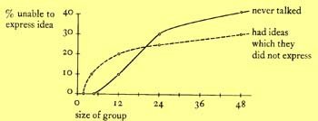
Meetings are the curse of work life :) Most of them feel like a drain of time and energy and your goal from the very first second becomes an exit strategy. I’ve generalizing of course but there are some elements of truth in what I said. Yet we know meetings are essential. To solve this opposing pulls we’ve found that a good solution is to make the meeting spaces feel cozy. You should feel that you are going to special place when you are going to meeting - a place that feels comfortable. We used a pattern for this (151 Small meeting spaces) and it is supported heaps of organizational behaviour research. For example Bernard Bass ran a study and published back in 1965 that showed the number of people in a group influences both the number who never talk, and the number who feel they have ideas which they have not been able to express.

Using several ideas from the pattern book and Microsoft’s data here are some of the things we decided about meeting spaces:

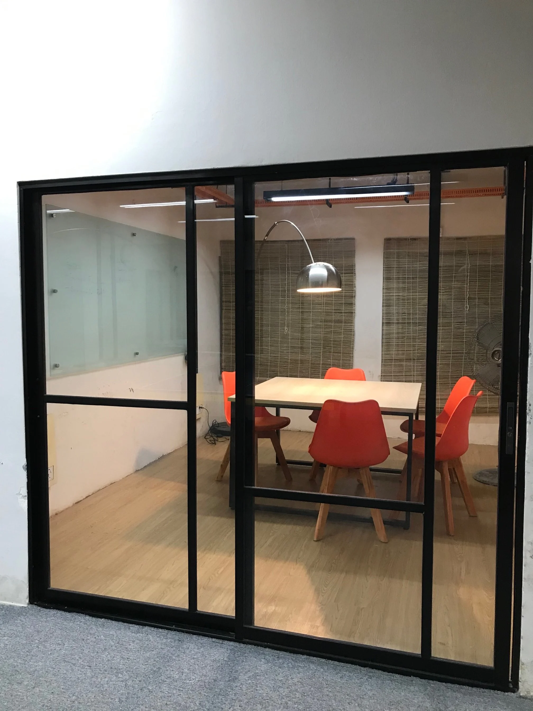
The space needs to be small and feel like you are moving into a comfortable space.

A pool of light on the meeting table (pattern 252) to tie the group members together.

Different types of chair (to make the feel of less corporate style meeting rooms and more home style spaces to talk).

Here’s a meeting room based on these principles from our redo (different chairs are not yet in there).

No approach from the back

This is our old one of making every seat with a wall at the back. The idea is that you should never feel that someone is watching you and your screen from the back. We keep our screens hidden from walking views. The overall effect of this is the feeling of safety and trust that it creates. It’s always been one of our strong views and we’ve written a lot about this before, here’s one recent one: Why we keep our screens private.

Keeping the team together

Software is a collaborative effort. Yet noise is a big issue for software developers because it creates distractions and reduces flow. How do we reconcile these two facts? Google actually had some really good data out about this after their big googleplex with hundreds of developers working on the same space went live. The gist of what we derived from it is that - the hum of work is good but only to the extent that the hum is related to what your interest is in. This fits with our beloved pattern of master & apprentice (pattern no 83). So we’ve designed the workspaces so that the team can stay together on its own without other teams mixed. We’ve also tried (where space permits) to have the lead (aka master) to have some more space and some privacy so that he can run short adhoc discussions without distracting the rest of the team.

Work and Play spaces

Ah this is our favourite as always. We’ve written about this very recently so I won’t repeat but point that post out: Work and play together - the secret of great work but the TLDR is that we have always had play areas very close to work areas. The idea is whenever someone needs a break they can quickly jump into a play area without a lengthy walk that becomes a barrier. In that light we have ping pong tables next to meeting spaces, adda nooks next to software development rooms or cricket running right next to work!

Special spaces and elements

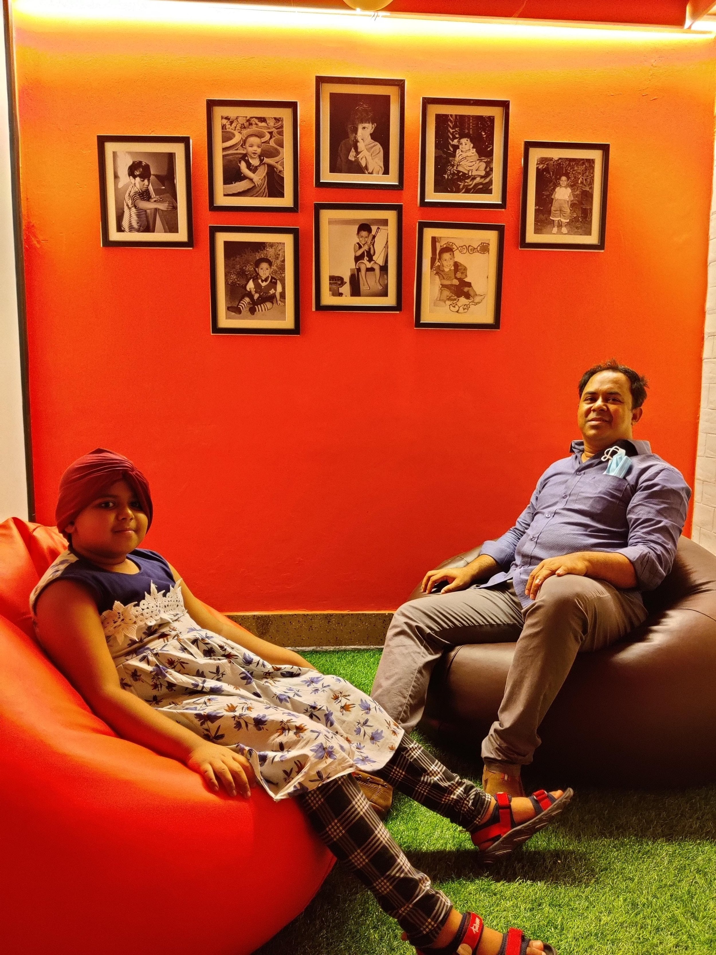
We wanted to make the work space feel special in some way. This is really an on-going effort but throughout our office space we’ve tried to bring in elements that creates a little bit of surprise (and hence it’s ongoing as any surprise becomes boring after a while). Some of these special places are spaces that connect us with our past or our family (e.g. pictures of our children or us as children!), some are just weird things on display, some are nice things to look at (like pictures, aquariums, art work, etc.). I think these special things brings in a variety in our working lives and make us think outside the box once in a while.

I’ll leave with a picture of one of these “special” places - with picture of some of us as children and with one of us with his daughter enjoying the space - this pictures tells everything about our goals and aspirations for our workspaces.

A full year of WFH

#1 tip for software developers (71).jpg

Last Friday marked a full year of WFH for Kaz Software. On March 19, 2020 we turned from a zero work from home company to a 100% one.

The WFH move

We were one of the first few companies to move to WFH because of the pandemic. There were a lot of unknowns, both about operations and about the business. There were very valid concerns of performance, our ability to work from home without any experience in managing software projects from home. We mitigated the risks by careful planning, our blog post from that day outlines some of the strategies we took: Adapting to COVID reality and posts from the time we started thinking about the challenges and how to manage the risks are also very interesting to read: 10 Tips for effective work from home, Remote work - what can go wrong? The title itself shows what was going on in our head :)

First two months of WFH

To our great relief we found that the transition from 0% WFH to 100% WFH was almost completely frictionless. Our risk mitigation strategies proved to be very effective. We had almost no hiccups and was hit the ground running from the first day. That is not say that we didn’t have any problem at all, over the first few weeks we started coming across some wrinkles that we ironed out with our planning. We wrote about our experience in the two month mark: WFH - our experience so far We soon learnt that the work environment setup at home needed to be right for better WFH and we resolved that constantly providing tech and facilities support from the office to individual developers at their home. This included supplying them with the chairs, monitors, etc. resolving technical issues on their home computers, if needed supplying them with their work computers and monitors, etc. We also realized that the office cannot be fully closed as access was required on emergency situations - so we had staff (properly isolated) living at or near the office building so that any resource can come over to the office when needed.

One year down

Now we are on our full year of WFH. And we can say with certainty that the WFH model has worked very well for us. We have absolutely no delays or work lapses that was directly because of WFH. We believe we have improved our overall performance by saving time on travel. We do however feel that for a collaborative work of software development a purely WFH model is not right, there is huge value in face to face interactions in software. Our current state is a mixed mode of WFH and work at office. We have made it optional for resources to work at the office if they are vaccinated or if they have taken enough precaution and ensure that they follow the health guidelines. This mixed model of WFH and work at office is proving to be quite successful. As the situation improves with wider vaccination we will see how much of this model we can retain permanently - so I’ll be back with another post about what we are doing!

Bye for now, stay safe!


16 Years of Kaz Software: Why we make our screens private

There are some simple rules at Kaz, and one of them is:

Our monitor should always be private.

Why?

Because, we trust ourselves and we also understand the nature of our work.

private screens kaz software.png

We trust ourselves to do the the work that’s assigned to us without the need for tracking and monitoring by anyone. And we also know that as a software developer we can be extremely effective one day, churning out amazing algorithms in minutes and be totally useless the next day - staring at our screen and wondering what it’s all about. That’s how human brain works. Our creativity, our energy and our performance are sometimes influenced and inspired by something - maybe by a dream from the night before, an article we read or an act of kindness by a fellow traveler on our way to work. And in the same way our energy can be diminished another day by a bitter experience, a sleepless night or a random bad news on the TV. We know that our performance will vary, but we trust ourselves to give our best, to make up our lost time of our bad days with the lightning speed of our good ones. Trust helps us do that.

The fact that the company, our managers, our colleagues and our juniors trust me, with my screen hidden, makes me perform my best. It gives me the safety that I need as a human. It makes me feel happy.


desk.png

Can a software company be 100% WFH?

Can we be 100% WFH_.png

The global pandemic has pushed us all to working from home (WFH). And overall across all industries WFH is proving to be a viable way of working. For the software world WFH was very common anyway, but now will complete WFH for months is showing to many that WFH works and this could be the new way of working with or without a global pandemic.

This has led many to ask:

Do we need to work at an office space at all?

We see a reflection of this thinking in big software companies already. Facebook and Shopify has already put out clear strategies for this change mindset about office space. A recent tweet from Tobi Lutke CEO of Shopify puts this succinctly:

Mark Zuckerberg did a longer version of the same thinking in Facebook post (of course)…

Our experience - WFH is great

At Kaz Software our experience has been extremely good with the 100% WFH mode. We posted recently about what we’ve learnt after two months of full WFH. Going by where we are we know that 100% WFH at all times is something that we can sustain very well. The time savings merely on the journey times on Dhaka’s infamous traffic itself justifies the WFH move.

But…

However, we also feel strongly about the need to be together as a team, working side by side. There is something in nature of work, nature of us being human that makes face to face interactions inherently better for some type of tasks. Here are some tasks we know we’ll have to revert to working together at the office.

Brainstorming software features

Brainstorming just doesn’t work the way it should in a virtual environment. There is something in the energy and enthusiasm in face to face discussion, something in the hand gestures of an excited colleague or heated argument about what is a good software and what is not, that is completely missing in the video calls. You just cannot do great brainstorming session without bring the team together.

Software UX/UI design phase

When you are designing UX as a team the constant to and fro between the designer and product manager or the developer is what drives the design forward. You take that out, move that into regulated video calls you will lose the creative spurts that happen in those face to face interactions. We would never want to take that out from our work, and this would be another phase of work we would always keep as a time to get together at the office.

Technical planning and architecture

Technical architecture and planning is something that can be done fairly well on the WFH mode. In fact some part of, it where a single architect is designing the overall blueprint, are best done alone and WFH works just fine for that. But when it comes to discussing the pros and cons of an architecture, debate out technology choices video conference calls fail miserably.

QA cycle

On intense QA and testing cycles of a project the constant need of the SQA team members to talk with developers, show them in action what is wrong, articulate their emotions of frustrations when a bug reappears or happiness when a bug has been fixed is something that can’t be done remotely. An intense QA cycle is very much like sports, where the developers are competing to create a bug free product or fix the bugs fast and the SQA team is working to find the bugs. The pace, the excitement, the mechanics of such a phase of the software development cycle just falls flat on remote teamwork.

So WFH is great. It’s here to stay. At Kaz we are prepared and committed to work from home as long as it takes. But we are also thinking of changing how we would work beyond the pandemic. WFH will be part our practice for sure, but we would also ensure that we work from office too. If you are in business of creating great software, as we are, there is no way but to meet and work side by side sometimes.

Stay safe!

Work from home: Our experience so far

After 2 Months of WFH.png

We’re hitting the two months’ mark for working from home (WFH). It’s been, overall, an excellent experience for us. We’ve turned, overnight, from a fully working from office to a working from home company. And thanks to careful planning and great execution by our systems and facilities teams we did not miss a beat in that transition. We wrote about the steps we took to move to home in this blog, today’s post is a summary of what our experience and learning has been over the two months that we’ve been doing it.

WFH is great

Working from home worked very well for us. We have not lost a bit of our usual efficiency, in fact sometimes we feel we have gained more with more focused work and collaboration. The time we save everyday by not travelling to work through Dhaka’s horrendous traffic is by itself a great win. Add to that the convenience of working in familiar environment and ability spend more time with family - WFH is a winner. So much of a winner that we think WFH will stay beyond this pandemic (yes there will be a time when will have no coronavirus!), we are planning to make WFH part of our regular working procedure when things get back to normal one day and we get to go back to the office again.

Work environment is important (even at home)

This was expected. As we went through the motions of WFH we realized over and over that having the right work environment is important even when you working from home. So having a table dedicated to work (rather than using the dining table), in a space where you are not disturbed is very important. Over the first week this realization meant many of us adjusted our work computer setup at home. Some even moved their furniture around, moved to a different room or opened up an unused space at home to setup a relatively noise free working environment.

The chair needs to be just right

The other big realization is that the chair that we sit on needs to be just right. Many our us had chairs that was OK to sit and play game for a few hours at home but when you are spending longer hours of work that chair becomes extremely important. We arranged to send emergency support missions to provide the work chair from the office to the home of some.

System support is essential

Our technical support team has been playing a very important role during this WFH period. As we went through the weeks of WFH new issues came up on home PC, work environment, access to resources at office etc. that needed direct support from our technical support team. Our systems guys have been busy providing Kaz developers spread throughout the city with technical help over phone and online, even risking a trip to the house to support on site with cables, monitors, internet troubleshooting, VPN setups, hard disc installations, etc. They also worked with our facilities team to switch on developer machines, coordinate access to resources available at the office.

Office needs to be accessible

However well you plan things in a company like ours where there are multiple projects with multiple teams working on separate deadlines and priorities the need for access to the office is essential. We expected this and had on site support at the office made possible by the fact that some office staff stayed next to the office space. Hence it was possible to provide access to any resource at the office on a very short notice. This is one of the key factors for successful full on remote operation.

So our fight against cornovirus continues by staying at home, maintaining social distancing and by working remote only. We plan to do this until all signs of the virus is gone - we pray and hope that it will soon.

Do not disturb a software developer in "flow"

#1 tip for software developers.png
The trouble is, getting into “the zone” is not easy. When you try to measure it, it looks like it takes an average of 15 minutes to start working at maximum productivity.
— Joel Spolsky

The world is full of distraction, particularly in this point in time. Facebook keeps enticing us with yet another friend’s trip to the tropical paradise we always wanted to go, Twitter pings us about Mr. Trump’s newest normal and that infernal device in our pocket keeps buzzing and beeping. Yet as software developers we are most in need of concentration, we need to think, juggle hundreds of ideas and pointers in our head and let our brain do its magic. A single distraction during this process is like a shrill cry in the middle of the silence in a temple.

I saw an amazing cartoon sometime back that explains this in very funny terms, I’ve copied it over here and keep it as the entire right column for today’s little rant about why coders should not be disturbed yet they are at every possible moment during their typical work day.

Here are some of the things we remind ourselves every day to stop disturbing ourselves and our colleagues at work.

Don’t ask a random question

The random passing question to a code deep in work is the number 1 culprit for distraction and loss of flow. It’s tempting to ask how the party went last night for example but asking it while someone has just managed to understand a weird for loop written years ago is a major sin. Please don’t ask randomly without checking if that person is free or not.

Keep developer rooms silent

Noise and particularly the someone speaking on the phone is horrible for anyone trying to concentrate. Developer rooms should follow the silence rule that libraries have. Discussions, debates, phone calls should all be taken out of the dev rooms into the verandas or the meeting rooms.

Open offices are bad

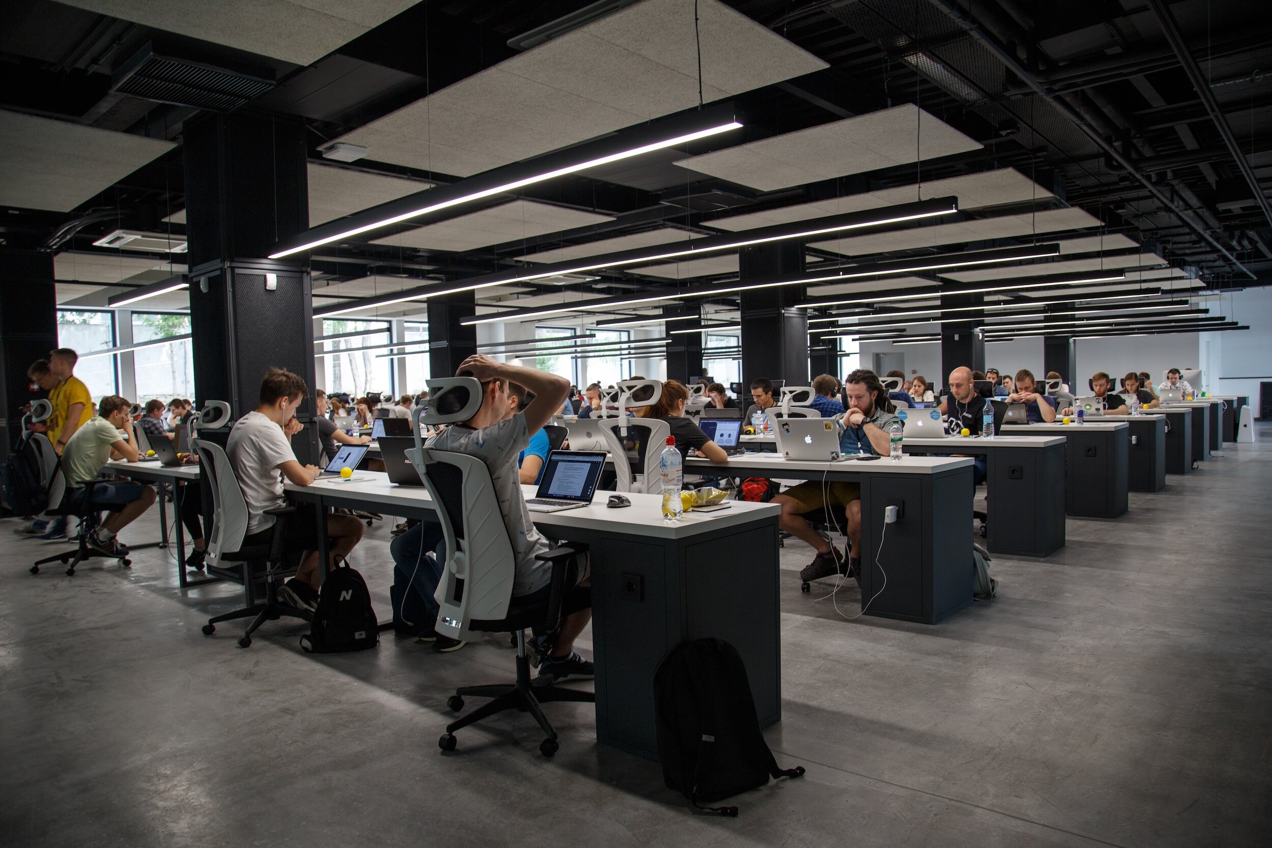
Large open offices where many different teams are working at the same time (and the worst of all developers working with sales teams sitting close by) are bad for concentration. We feel strongly about having semi private offices where only a single small team sits together with their lead in a separate space or room in that area. We’ve written many times about workspace layouts that are good for software companies. Here’s a recent article: To cubicle, or not, that is the question.

Optimize meeting start times

Work meetings in the middle of workdays are a major source of distraction. It prevents developers from concentrating and working on a large piece of software in the fear that they will get distracted in the middle. And most meetings lead to a long time settle back to full concentration. Meetings should be timed at points when the developer has not yet started to pick up tasks (say beginning of the day) or has had a natural break in work (say right after lunch).

Self discipline goes a long way

Last but not least: funnily enough studies show that we ourselves are a major source of distraction. With all the social media and youtube just a click away this isn’t too hard to understand. This is where the self discipline comes in, prioritizing our work and keeping set timeline for launching FB or even checking our emails has a huge impact on our productivity.

To cubicle, or not, that is the question.

Most things in life has the Shakespearean ambivalence, but I can say without a shred of doubt that there is no uncertainty about the cubicle:

Cubicles are bad.

So “or not” is the right answer.

But if not cubicle, what?

That is where Shakespeare has the upper hand.

What's the best Work Space layout_.png


Companies large and small, universities and architectural firms have been trying to answer that question with mixed results. Let’s try to approach this with some data that proves quite strongly two things:

1. Proximity matters even in the age of digital

It has been found over and over that the physical proximity of people bring in more positive interactions and collaboration. Team that has team members on the same floor, same room are more efficient than team where the members are physically disbursed (yet connected with all kinds of communications platforms). MIT media lab has done extensive studies on effects of proximity on collaboration a summary of this was done by one of the researchers as follows:

…the probability that any two people on a corporate campus will interact physically or digitally is directly proportional to the distance between their desks…
— Ben Waber, Scientist MIT Media Lab

2. Interaction between different work groups reduces productivity

If there are separate groups within the company that work on completely different projects or areas no benefits come in making them interact more, in fact it reduces overall productivity of both teams. Research carried out in a major German bank showed that increasing interactions between teams undermined performance. So they moved teams into separate rooms. 

If you take the above 2 points as gospel then what is the logical conclusion? Keep individual teams together but separate from other teams. Simple.

A Pattern Language: Towns, Buildings, Construction (Center for Environmental Structure Series)
By Christopher Alexander, Sara Ishikawa, Murray Silverstein, Max Jacobson, Ingrid Fiksdahl-King, Shlomo Angel

And…drum roll please…. we have always known this answer. The answer has been in page 414 of our favorite book on work space design - A Pattern Language by Christopher Alexander.

“The fundamental learning situation is one in which a person learns by helping someone who really knows what he is doing.

Therefore:

Arrange the work in every workgroup, industry, and office, in such a way that work and learning go forward hand in hand. Treat every piece of work as an opportunity for learning. To this end, organize work around a tradition of masters and apprentices: and support this form of social organization with a division of the workspace into spatial clusters - one for each master and his apprentices where they can work and meet together.”


With our offices in older brick built houses with small rooms in the older part of Dhaka adopting this pattern has been easy. We can take a group of adjacent rooms (sometimes converting a connecting veranda that is very common in the older designs of Dhaka houses) to form the team space. We try to give the team lead some space of her own, ideally a room all by herself if possible. This makes it easy for her to act as the “mentor” when needed and also acts as the defacto meeting room where conversations (and noisy debates) can happen without disturbing the rest of the team members.

Brick walls ensure that interference from other teams and completely unrelated conversations don’t hinder the flow of the work of the team.

So as I said, Shakespeare has nothing to say to us when it comes to office layout. We got it figured out. But we love him anyway :)

Here’s the famous page 414 btw…

pattern 83.png


A/B Testing the culture of your company

Wouldn’t it be great if you could A/B test the policies that you take for your company just like you A/B test user adoption for your designs? If we could somehow try our decisions out and then take the one that works better it would take the heartache out of a lot of everyday decisions.

Let’s face it, the way we run our companies, and I’m talking about everyone - from the mini startup to the mega corp., is purely a version of gambling. Let me break down some of the common “rationale” for our policies for the company -

Gray Abstract World Intellectual Property Day Social Media Graphic (1).png

Excuses for bad policies:

“That’s the way it’s done everywhere”

And probably that’s why most companies have dismal work cultures.

“If we don’t do this now, things will go out of control”

As if it’s a kindergarten we are running or worse a prison :(

“There must be checks and balances”

Yeah, but when you have to say it out to justify a policy chances are you are forcing something in that’s no check and no balance.

Anyway, you get the picture (and this is just a rant post). Getting back to my point, A/B Testing - most of the times we are never sure if the policy we are putting in place is a good policy that makes the company efficient and makes the people happy (yes, you can have them both!) or if it will just sap the soul out of the people and lead to inefficiencies and backstabbing. Take the classic “Performance Review” the classic “That’s the way it’s done everywhere” thing. Is it good or bad? Without a performance review your best people will not feel they are being prized or valued. But with performance review aren’t you bringing in competitiveness? Particularly in software development doesn’t the best coder in the world go through a patch of really bad performance (which is offset by 10X performance at other times)? There is no solid gold answer - only “buts” and “ifs” and “depends”. btw if I’ve got you riled up here’s a good read from HBR - Why More and More Companies Are Ditching Performance Ratings

So if we just had a simple way of trying out a policy (maybe in part of the company) and trying something different (with another part) and the checking for the results and pick the one that’s better. Anyway without a foolproof system for A/B testing here’s what we do at Kaz whenever we we trying to put a new policy in place or change an existing one:

Have a “feel out” phase

Every policy we adopt goes through a “feel out” phase where it’s discussed formally and informally during team meetings, lunches even hallway discussions. This gives early feedback about the policy, get amazing ideas of what might work and what might not work and works as great PR campaign for the policy.

Introduce incrementally

All policies are introduced very slowly and in parts. This makes it easy for us to find our mistakes and fix them without making a huge mess. It’s amazing how many times we have fallen face in even when the plan sounded great during our feel out.

Seek feedback

This is the important one - seek feedback from the people who are most affected by the change. There might be some very good ideas about tweaks that might work.

Be prepared to change or roll back

Nothing should be set in stone. As long as we achieve the goal we should not bother about how we achieve it. So if something doesn’t work just change it or roll back. Remember that it’s not a prison that you are running and there is absolutely nothing wrong for a company to admit that it was wrong.

Measure company culture

Now this is hard one. If you can’t measure and put numbers on culture you can’t find out if something is working better or making things worse. But it’s not easy and some would say next to impossible. Our thinking is that you don’t really need perfect system (there is none), as long as you have some measure it’s better than none. So a simple poll might be a good way out, or you can go the full Titanium card path and try something like MIT’s sociometrics (MIT being MIT had to come up with device to measure culture):


We wrote a series sometime back on how we do and did things in quantifying culture The method doesn’t matter as long as you have some way of understanding the effects that you policy changes are causing.

But still, we would love a scheme where we could do those A/B tests easily. Maybe MIT will come up with something? :)

Burn the cubicles - in the pursuit of happiness

Kaz revolves around the word happiness. It’s around everything we do. We continually ask ourselves: “are we happy?”. We have a rule of thumb about failure that says: if one day we wake up and think of going to work as a pain then we will know that we have failed.

Many question our principle of happiness as the core business philosophy. Many are clearly baffled that this can be true. And many just laugh it away as a triviality – not believing it to be true. But if you think about it it’s the most obvious thing, it’s amazing that so many companies in the world miss something so basic. The pursuit of happiness is inherently a human endeavor. We spend most of our waking life at work, a significant number of modern human relationships are connected with work – given these facts isn’t it obvious that we need work to be based around happiness?

So what does the pursuit of happiness entail at workspace? There is no sure shot formula – you just have to go by your feelings. But if you were to ask us, what is one thing we must do as the first step in the pursuit for happiness – we would scream:

Say NO to cube farms

Cube farms are evil. They are inhuman. They were made by some alien droids that had no concept about being human and living a normal human life. If you want to achieve anything close to being not sad – burn those cubicles.

So if not cube farms then what? People have to work somewhere. Well we believe that the most natural space in our lives is our homes. So if we can mimic anything about our home at workplace that will bring happiness. So that is why we love our office that is not a purpose built open space for cubicle animals. We work in houses built in the 70’s that we have converted to offices ourselves. They are not inhuman multi-storied building but human two storied buildings (amazingly the two building we are based in are exactly the same architecture because they belong to the same family!). They have open space in front with large trees that have real fruits in the summer (an amazing thing by the way in the concrete mess of Dhaka). They retain old mosaic patterns that were very popular in Dhaka during the 70s and 80s.


Our seating is as asymmetrical as possible – almost chaotic. We try to give large tables that all look a bit different from each other. We sit with the wall at the back – so that it feels safe and we don’t feel watched. Our monitors are kept in a way so that the screen cannot be viewed by someone approaching us – so that we have our privacy. As un-cubicle like, as possible.

So once again, do everything you can to your workspace to stay away from the cube farms. Be happy!

// Shameless plug begins:

Get our expert help in your software projects today!

// End of shameless plug :)


Cat on a hot software company

If you are curious about the title (and you should be!) the explanation is easy:

The blog is about Ms. Meow the cat - the official Kaz Software mascot. The blog is also tangentially about the importance of making a place of work, particularly a place of creative work, feel like a real human habitation (as opposed artificial "corporate" one). And last but not least the title is a shameless attempt to push a picture of Elizabeth Taylor and Paul Newman in of their finest moments :)

The mascot

Ms. Meow is a cat with a strong personality. She knows what she likes (techies and food) and she knows what she doesn't like (admin droids and banana). She is very conscious about her career improvement, as can be seen below - she learning the art of SQA with full dedication. (I'd like to point out that she is far from an ornamental mascot - she is the savior who protects us from the clutches of the evil mice :)  

WP_20140128_bw.jpg

The workplace like a real human habitation

I agree, this paragraph looks suspiciously like a weak attempt to bring credibility to this blog post. But I assure you it is not. From the day we started ten years ago, we made innumerable decisions to make sure that our place of work feels, as close as possible, like home. This is not an easy task, mind you. It is not as easy as putting some pictures on the wall or setting up a comfy place to sit, etc. Well I should say it not just those things - there are many reasons why home feels like home. The visual aspect is only a small part of this big story. 

But why make it like home at all? Well that is a long tale with no definite story-line. But it is really a point of view (amongst many) about workplace. But it is a view that we at Kaz subscribe to very passionately.

I can't do it justice, so let me quote something I read recently in a book review (and I quote without credit - in the world view that in the post Google world there is very little need for such a thing): 

Understanding that humans biologically evolved to cooperate and that leaders emerged to protect the group, organizations that create environments paralleling those early conditions will bring out the best in us. This means taking steps to avoid the allure of abstraction in modern life by keeping it real and avoiding the perils of scale by keeping team sizes that mimic those of human tribes.

The picture

OK, cutting to the chase, here is the picture. It is from the movie Cat on a hot tin roof made in 1958. When the monochrome was at its best in human history and when nothing could beat the sizzle of Elizabeth Taylor and Paul Newman. (As a last attempt to justify it, I'd like to note that it goes with our theme in this blog of putting up old b&w pics of movies that are notionally connected with the content of the blog).

Elizabeth-taylor-cat-on-a-hot-tin-roof-1958.jpg


Custom Carrom Board for a Custom Software Company

Our annual Kaz Carrom League is in the offing. Carrom is a game we love to concentrate our passion on during the rainy months of June and July. If you know anything about Bangladesh's rain you'd know why :)

With the carrom fever coming up we've been in search of the perfect carrom board since our old ones are dying out. But one of life's lessons was the fact that there are no perfect carrom boards out there.

Just as some problems in this world just needs a custom software, we needed a custom built carrom board.

So work is in progress for that perfect board. I list some of the spec items for this perfect board for your reference.


kaz-carrom-league.png

custom-carrom-board-varnish.JPG

Varnished sides with grains that contrasts well with carrom men

Did you know that the carrom disks are called men?  They are are and they deserve the proper varnished sides to settle down.


Extra wide sides

Because you need need your hands to relax while you wait for your turn.  Basic primal requirement.

custom carrom board extra wide edges

custom carrom board corners

Smooth rounded edges

There is no insult in life greater than being pronged by the sharp edge of the board when you've just missed your chance to grab the queen


custom-carrom-board-joints.JPG

Strong joints to last a lifetime

Some people say that the strength of the joints transmit to the spirit of the game. 


custom carrom board back

Extra strong back support

These boards will last a long time as will Kaz and we want to make sure posterity remembers us.  

N.B. Just in case you are new here: we are a custom software company  in Bangladesh making custom web, desktop and mobile apps for other companies and being very good at it! Check out this page to know more about our software development work culture and environment.

Workspace design for a software company

We are fanatical about our culture, we think as a custom software company this is our biggest strength that we can offer to our clients. A good workplace culture brings in great software, the equation is that simple. And the first thing in creating a good workplace culture is create a setting for it - creating the right physical environment that signals the values that we care about. Workspace design is key to a great software company. It is just as easily as important as the software development IDEs and tools. And this is not something new and specific to this space, a craftsman's workplace has always been important, his craft is enhance by the right choice of environment, the right arrangement of things. 

We realized this importance right from the beginning, and the first chance we got to setup our environment was in 2005 when we moved from our makeshift offices to a place that we could mold to our needs. We decided to call that place the Nirvana - because that was exactly what we wanted to make our place. 

We laid down our goals about workplace as follows and those goals have never changed for us, they define all decisions we take about modifying our environment.

  • Workplace has to feel like home.
  • Workplace has to be somewhere you can relax.
  • Workplace has to be fun. 
  • Workplace has to have places where you can always find a quiet place to sit and think. 

We read up all there was to read (or rather all that Google knew about). At the end two resources helped us a lot in our quest for the perfect workplace for software development. 

The first and by far the most important one (over the years) is the amazing book The Pattern Language by Christopher Alexander - which is a list of patterns that make great places of comfort. This obviously appealed to us as software engineers - great fans of design patterns in software design (there is actually a direct link between the two - with the pattern language book influencing the need for design patterns. Here is a link where Prof. Alexandar made a keynote speech at ACM conference on OOP that tells the story from his side.). This book gave us almost step by step instruction of what to do.

The next resource that was a great help was our guru's blog at joelonsoftware.com a lot of his writing guided us, but the must read was the bionic office, read also his updated one (when they moved to their new place). Joel is very opinionated. And that helps, he puts is logic in strong terms and you tend agree or disagree with him pretty early on. A lot of his stuff we followed blindly but a lot we did not and some we initially did but over time realized that there are better ways of doing things and changed.

What we started in 2005 has been an on going thing for us. Because no design is perfect, as we tried out various ideas some worked like magic but some needed subtle changes. Over the years, we have grown much larger in size and got hold of more space next to the original Nirvana. We adapted our workspace design ideas to fit with what we got from feedback from our people. And today at the middle of 2013 we have a set of rules for setting up things which are slightly different from our original and we know for sure it will change over time too. 

I describe below what we have now - our workspace design plans, office layouts and placement of different objects within our working environment. I will do most of it in pictures with little notes to go over the rationales or things we have learnt that are important about the elements in the layout. 


The work desk

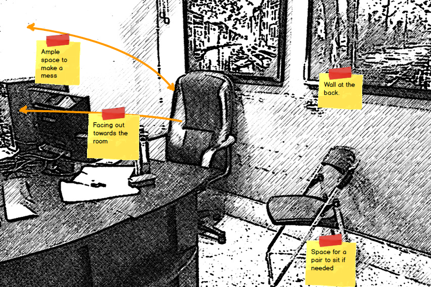
  • We feel strongly about the pattern that there should be a wall at the back and that you cannot be approached only from the front. This creates a feeling of safety and it is one thing we never compromise on.
  • We place the seats so that you are looking out to the room at other people working on the same project as you are (another pattern). 
  • We are against Joel's single developer working alone in room model and also against Googleplex like or Agile war room like setup. But if a team wants to adopt a war room setup for limited time that is ok too. 
  • Desk space is vital for a proper mess. And a proper mess is vital for some developers, SQA engineers and designers! 
  • Pair programming needs elbow space! 
desk.png

Transition Spaces

  • Transition spaces like corridors are vitally important for a software company. They are where most solutions are found and most designs are finalized. So they need big whiteboards with markers.
  • The zen view pattern says points of beauty should be in transition spaces so that it leaves a good memory when you go to your ultimate destination. We agree and try putting in all sorts of points of interest like artwork, aquariums, etc.  
  • Not in the pic below, but transition spaces need to be dark with splashes of light (another pattern) - this helps the traveler feel they have reached home when they reach their room which are typically brightly lit. (Bit off the rocker statement I agree but we seriously believe this).
corridor.png

Meeting Spaces

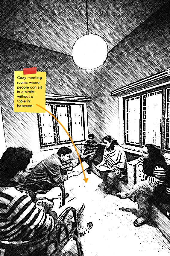
  • We make the meeting spaces cozy so that people feel comfortable being there.
  • We make sure there are no unnatural obstructions like tables in between people. 
  • We put strong colors in one or more walls - this is gives a jolt to the group when them first go into the room. A jolt sometimes helps people think out of the box. Strong colors also make people confident and help them take bold decisions. 
meetingroom.png

Eating Together

  • We eat together because that feels like a family.
  • We make the room where we eat feel like a dining room at home, with pictures of our kids, little decorations we've picked up from our trips around the world, etc. 
  • We make the center of the table well lit and the sides a bit darker to heighten the feeling of grouping. 
eating.png

A Place to Contemplate or to Meet 

  • A place with a view; so that you can sit, relax your eyes a bit and think about things.
  • Some comfy chairs ideally cane to make it feel more like a garden patio.
  • A point of interest - like a big earthen bowl with water and aquatic plants in them, etc. 
ip.png

N.B. Just in case you are new here: we are a custom software company  in Bangladesh making custom web, desktop and mobile apps for other companies and being very good at it! Check out this page to know more about our software development work culture and environment.

In praise of mafia in a software studio

Kaz has always had a mafia. It is an institution that is deeply ingrained in our culture. We have always had a Don in our history and the personality of the Don defined the nature of our culture and our outlook at that point in time.

original.jpg

​"A mafia!" you might say.

"Yes a mafia" we would answer. A mafia with all the characteristics of the real thing. A parallel force to the legal authority, a group with great power with dubious ways of getting things done, running a protection racket yet somehow benevolent to those who accept its existence. 

The mafia at Kaz or "The Underground" as it is euphemistically referred to most of time is a real force. A force of good. They set the tone of all our fun events. Their activity covers just about everything - from setting up a cricket tournament (where they run the betting ring) to arranging gifts for our weddings (where they send out their goons to collect money). Kaz mafia has also been rumored to be very much in contact with the authorities too! 

We think this alternative force is absolutely essential for us. Since this force is given a lot of power to act and speak in our system - it is possible for voices to be heard from a different group than the management. Underground has an image of the protector of the techies from the evil (and acts of insanity) of the mad group of non techie sub human droids that run the management. This image makes it easy for dissent to be voiced about policies or rules at Kaz. And this makes it possible for the management to "understand" their mistakes and make amendments to the rules and policies. It is really like a check and balance in the organization. And for a software studio where the main groups that are essential to the business are software people who run from a slightly different dimension than rest of the human population (to put it lightly) - this check and balance is very important.

​So I sing today the praise of our mafia and our great Don. 

N.B. Just in case you are new here: we are a software company in Bangladesh making custom web, desktop and mobile apps for other companies and being very good at it! Check out this page to know more about our software development work culture and environment.

The theory of software studio

The question I keep asking myself over the years in this space is "why isn't a software development company a software studio?"​

We just love to call a place where websites are designed and made a "web design studio". A design and branding place is definitely a studio, so is an artist's workplace or a photographer's business. The word studio conjures this nice image of creativity at work, a feeling of something beautiful being made or an expectation of seeing something breathtaking.​

Compare the word studio with what most software places are named or referred to as. The nicer ones with at least some feeling for the art are: software houses, shops, services or pods. The more formal ones are: companies, centers and offices.  But the award goes to outsourcing places with depression oozing from flowery phrases like: low cost, offshore, cost effective, transparent, time tracked, video monitored, screen captured, toilet-time controlled, caged programmers...I'm just joking about the last ones but only just. ​

​But isn't software all about creativity? The art, craft and engineering war is not new - but even the most ardent engineering fan would accept that there is creativity involved somewhere in the process of making software. Whether you are making the software in-house or you are outsourcing it to be made somewhere far away the fact remains that there needs to be a certain amount of creativity and element of art involved in the story. So there is no big crime in using a word like studio to describe the place where all of this is taking place.

IMG_1479.JPG

And what a difference does a single word make! Software Studio - brings to mind pictures of cozy places, of dark rooms with splashes of light where there are screens and of places to relax and chat.​

Words reinforce our view of the world and that in turn changes the way we think about things and eventually our actions. So here is my simple theory:

If a software company just starts calling itself a software studio (or something cushy like that), soon it will become a place where work is fun and creative.

A bit rash, random and without proof for sure - but aren't all theories something like that at the beginning? ​

N.B. Just in case you are new here: we are a software company in Bangladesh making custom web, desktop and mobile apps for other companies and being very good at it! Check out this page to know more about our software development work culture and environment.

Patterns in workspace design - redo

This is a post that was done way back in 2007. But nothing much has changed about our philosophy of creating an environment for creativity. We are redoing a lot of the space designs this year and will blog about those efforts. And as a starter we would like to re-post this for those who've not read it.

With the designer workspace project in progress at Kaz, I was revisiting the principles for achieving the perfect design of workspaces. These patterns as they are formally called were the guiding light when we were planning the Nirvana (our office space). 

Software has patterns. Patterns are tried and tested ways of architecting systems that just work perfectly for a broad set of similar problems. Made famous by the gang of four (GOF) in the early 90s when they published their book Desgin patterns

Interestingly the idea of patterns comes not from software but from architecture. We all have felt that some buildings or houses just feel more comfortable than others. There are some places where an adda is always a good adda. The person who put this into concrete form was Christopher Alexander in his book The Timeless Way of Building

a_pattern_lang.gif

Since I can’t possibly describe this better than the great guy himself, let me quote from the book itself:

“There is one timeless way of building. It is a thousand years old, and the same today as it has ever been. The great traditional buildings of the past, the villages and tents and temples in which man feels at home, have always been made by people who were very close to the center of this way. It is not possible to make great buildings, or great towns, beautiful places, places where you feel yourself, places where you feel alive, except by following this way. And, as you will see, this way will lead anyone who looks for it to buildings which are themselves as ancient in their form, as the trees and hills, and as our faces are. ” 

As the quote sort of hints, the book was more philosophy than practical hints about the patterns. The next book was the practitioners' handbook for the patterns – the analogy of the GOF book in architecture: A Pattern Language: Towns, Buildings, Construction. One of my all time favorites, this book is worth reading just for your soul.

Before being carried away let me pin down a few patterns that is very relevant to workspaces and that we are definitely consulting during the planning. All of the following are stolen from the great book. 

Note that the numbers represent the pattern number used in the book (there were 253 catalogued). You can get a whole list of patterns here.

134 Zen View 

If there is a beautiful view, don't spoil it by building huge windows that gape incessantly at it. Instead, put the windows which look onto the view at places of transition- along paths, in hallways, in entry ways, on stairs, between rooms. 

135 Tapestry of Light and Dark

Create alternating areas of light and dark throughout the building, in such a way that people naturally walk towards the light, whenever they are going to important places: seats, entrances, stairs, passages, places of special beauty, and make other areas darker, to increase the contrast.  

146. Flexible Office Space

Lay out the office space as wings of open space, with free standing columns around their edges, so they define half-private and common spaces opening into one another. Set down enough columns so that people can fill them in over the years, in many different ways- but always in a semipermanent fashion. 

152 Half-Private Office 

Avoid closed off, separate, or private offices. Make every workroom, whether it is for a group of two or three people or for one person, half-open to the other workgroups and the world immediately beyond it. At the front, just inside the door, make comfortable sitting space, with the actual workspace(s) away from the door, and further back. 

183 Workspace Enclosures 

Build each workspace an area of at least 60 square feet. Build walls and windows round each workspace to such an extent that their total area (counting windows at one-half) is 50 to 75 per cent of the total enclosure that would be there if all four walls around the 60 square feet were solid. Let the front of the workspace be open for at least 8 feet in front, always into a larger space. Place the desk so that the person working at it has a view out either to the front or to the side. If there are other people working nearby, arrange the enclosure so that the person has a sense of connection to two or three others; but never put more than eighth workspaces with view or earshot of one another. 

185 Sitting Circle 

Place each sitting space in a position which is protected not cut by paths or movement, roughly circular, made so that the room itself helps to suggest the circle- not too strongly- with paths and activities around it, so that people naturally gravitate toward the chairs and cushions loosely in the circle, and have a few too many.   

250 Warm Colours 

Choose surface colours which, together with the colour of the natural light, reflected light, and artificial lights, create a warm light in the rooms.  

252 Pools of Light 

Place the lights low, and apart, to form individual pools of light which encompass chairs and tables like bubbles to reinforce the social character of the spaces which they form. Remember that you can't have pools of light without the darker places in between.

N.B. If you are new to our blog here is a quick summary of who we are: we are a software studio based in Bangladesh. We work on outsourced software projects from all over the world. We are passionate about the workspace and culture of a software company.