Workplace design for a software company
- Jun 10, 2022
- 6 min read
Updated: Aug 29, 2025
We are turning 18 this month! Around every birthday we have we keep getting asked about our “secrets”. The secrets of how we run things, how we managed stay professional yet a fun place to work, how stayed profitable yet spend so much on “extras”, etc. And every birthday time we usually end up writing about our little “secrets” - although they are not really secrets, more like common sense. Today’s post is about one such common sense “secret” - what kind of workplace design (we strongly believe) works best for software companies.
First, let me point out that we have written around this topic before, so some of this will be regurgitation but some maybe be new - coming from our added experience and also a recent redo of the office space. So here goes…
Patterns rock but some new cool kids do too
I cannot but mention this side note: there is a direct link between the software design patterns and these architectural patterns. The pattern language book had been the seed for the idea of categorizing good software architectures and plans to a list of standardized design patterns by the famous GoF.As a tribute this connection, Prof. Alexander (the principal writer of the Pattern Language book) was asked to do a keynote speech at ACM conference on OOP which he started with this line :)
“Thank you very much. This is a pretty strange situation I find myself in. I hope you sympathize with me. I'm addressing a room full of people, a whole football field full of people. I don't know hardly anything about what all of you do. So—please be nice to me”
Just as with software design patterns workplace design also has patterns that can be used to create good designs! The classic in this space is The Pattern Language which first laid out the ideas of patterns in architecture or space design that leads to “good feelings”. Essentially the writers were trying to list and categorize the design elements that make some places feel comfortable so that these design elements can the reused. Within the 253 patterns they identified there are some gems for the workplace. We always tried to use as many of them as possible in our work place design.
Over the years we have found that some work better than others for software companies. In our redo we kept to the ones we know works but we revisited the patterns to see if we can glean out new ones. Into this framework of patterns we have now additional public information about the workspace design thoughts for software companies like Google or Microsoft . We’ve been looking at what they believe is great and trying to steal as much as possible from them too! Obviously we don’t have as deep a pocket as the big guys so however much we like the slide at Google we just couldn’t convince our finance guys to fit that for us :(

Office space for the rest of us
OK, that slide at Google is just too good but since we can’t do that, let me go over some of the principles we have used in our redo.
Office needs to feel more like home
This has been one of our big ones from day one. We have always hated the “corporate” look of traditional software companies which look unnatural. By brining in elements from our home and allowing the organic growth of that workspace you create connection with the workspace. We thing that a workspace that looks and feels alien to what you are used to makes you disconnected from that space and you cannot have the same emotions and the same feeling of ownership as a space that feels like home. A good example would be a trip to a 5 star hotel - however beautiful it looks like, how comfortable that stay is like, you still feel that you are not part of that space, you are nothing but a temporary visitor. Contrast that with a stay at an airbnb, you almost instantly connect with place the moment you step in (assuming of course you’ve picked the right place!). The good thing is that the “home” feel is easy to recreate in most places. In Bangladesh the place of “adda” (chit chat) is a key for a good home feel. And we easily achieve that by bringing in elements of bamboo blinds and cane furniture. This is something we have used extensively in our redo from meeting rooms to “adda” spaces.

Meeting rooms need to be “cozy”
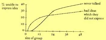
Meetings are the curse of work life :) Most of them feel like a drain of time and energy and your goal from the very first second becomes an exit strategy. I’ve generalizing of course but there are some elements of truth in what I said. Yet we know meetings are essential. To solve this opposing pulls we’ve found that a good solution is to make the meeting spaces feel cozy. You should feel that you are going to special place when you are going to meeting - a place that feels comfortable. We used a pattern for this (151 Small meeting spaces) and it is supported heaps of organizational behaviour research. For example Bernard Bass ran a study and published back in 1965 that showed the number of people in a group influences both the number who never talk, and the number who feel they have ideas which they have not been able to express.

Using several ideas from the pattern book and Microsoft’s data here are some of the things we decided about meeting spaces:
The space needs to be small and feel like you are moving into a comfortable space.
A pool of light on the meeting table (pattern 252) to tie the group members together.
Different types of chair (to make the feel of less corporate style meeting rooms and more home style spaces to talk).
Here’s a meeting room based on these principles from our redo (different chairs are not yet in there).

No approach from the back
This is our old one of making every seat with a wall at the back. The idea is that you should never feel that someone is watching you and your screen from the back. We keep our screens hidden from walking views. The overall effect of this is the feeling of safety and trust that it creates. It’s always been one of our strong views and we’ve written a lot about this before, here’s one recent one: Why we keep our screens private.

Keeping the team together
Software is a collaborative effort. Yet noise is a big issue for software developers because it creates distractions and reduces flow. How do we reconcile these two facts? Google actually had some really good data out about this after their big googleplex with hundreds of developers working on the same space went live. The gist of what we derived from it is that - the hum of work is good but only to the extent that the hum is related to what your interest is in. This fits with our beloved pattern of master & apprentice (pattern no 83). So we’ve designed the workspaces so that the team can stay together on its own without other teams mixed. We’ve also tried (where space permits) to have the lead (aka master) to have some more space and some privacy so that he can run short adhoc discussions without distracting the rest of the team.
Work and Play spaces
Ah this is our favourite as always. We’ve written about this very recently so I won’t repeat but point that post out: Work and play together - the secret of great work but the TLDR is that we have always had play areas very close to work areas. The idea is whenever someone needs a break they can quickly jump into a play area without a lengthy walk that becomes a barrier. In that light we have ping pong tables next to meeting spaces, adda nooks next to software development rooms or cricket running right next to work!
Special spaces and elements
We wanted to make the work space feel special in some way. This is really an on-going effort but throughout our office space we’ve tried to bring in elements that creates a little bit of surprise (and hence it’s ongoing as any surprise becomes boring after a while). Some of these special places are spaces that connect us with our past or our family (e.g. pictures of our children or us as children!), some are just weird things on display, some are nice things to look at (like pictures, aquariums, art work, etc.). I think these special things brings in a variety in our working lives and make us think outside the box once in a while.
I’ll leave with a picture of one of these “special” places - with picture of some of us as children and with one of us with his daughter enjoying the space - this pictures tells everything about our goals and aspirations for our workspaces.


