Crafting Software User Experiences That Matter

Creating a visually appealing and user-friendly interface is no longer just a bonus – it's a necessity. User Interface (UI) design plays a pivotal role in determining the success of any software or application. UI design is the first point of contact between a user and an application. A well-crafted UI not only captivates the user's attention but also enhances the overall user experience. Over the past 20 years that we have been in the business of making software products for companies all around the world if there is one common theme that we’ve found that is: UI matters. If the market needs a certain software then the only deciding factor for the success of a software to fill that need is the quality of it’s UI - it’s as simple as that.

We recently asked our design team and their friends in the industry to come up with suggestions and thoughts about UI/UX and here’s a summary of those:

First Impressions Matter

Just like meeting someone for the first time, users form quick impressions about software based on its interface. A visually appealing and intuitive UI creates a positive first impression, setting the stage for a satisfying user experience. This came from a sales lead of one of our clients. And from her experience, the first few minutes when she demos the software she has always found the right UI/UX to make or break a sale. “It’s not so much that the software needs to be beautiful to look at”, she added, “although that’s important, what becomes important after a few clicks is how intuitive it feels and if my prospect can relate with the flow of work that the software is showing”. There’s even some research proof around this, in a study, Forrester found a significant correlation between improved sales and UI/UX improvements, over hundreds of software projects in their study.

User Engagement and Retention

But at a basic level, the goal is to get new customers familiar with whatever the product’s core functionality is—the feature that they came for—so they can quickly reach their ‘aha’ moment. Then, based on their usage, introduce them to another feature, and then another, and so forth.
— Ryan Matthew, neuronux.com

A well-designed interface keeps users engaged and encourages them to explore the software further. It directly influences user retention, as users are more likely to stick around and use an application regularly if the interface is user-friendly and enjoyable.

User engagement and retention was a common topic from designers and founders we talked to. Someone referred to a recent article about how UX and user retention is directly linked. It talked about how even the reputedly boring B2B software can sell itself with the proper UI/UX.

Enhanced Usability

An intuitive UI simplifies the user's interaction with the software. By following design principles that prioritize user needs, designers can ensure that users can easily navigate through the application, accomplishing tasks efficiently and without frustration. Enhanced usability was what everyone pointed out. It’s obviously the most important outcome of any great UI/UX.

Basic rules of UI design

Our design team came up with some basic rules of UI design that they feel every software should be mindful of. Here’s the list:

Put the User First

Empathy is the cornerstone of effective UI design. Understand your users, consider their diverse experiences, ages, and abilities. Familiar designs and practices contribute to a seamless user experience, ensuring that your software is accessible to a broad audience.

Constant Feedback

Implementing feedback mechanisms within the interface is essential. Users should receive validation for every action, helping them correct mistakes or stay focused on their next steps. Respectful error notifications contribute to a positive user experience.

Respect Users' Time

Time is precious, and users appreciate interfaces that respect this. Onboarding processes should be concise, especially for experienced users. Minimize data entry and avoid redundant prompts, ensuring users can swiftly accomplish their goals without unnecessary delays.

Airbnb interface is a great example of respecting user’s time. Here’s a screenshot of the interface after a search for places in Paris. In one single screen they’ve managed to put in pretty much everything the user will need to do the sort and filter the place they are looking for: price, looks, locations relative to each other, reviews.

Consistency is Key

Achieving a balance between innovation and familiarity is challenging but rewarding. Consistency in design elements such as prompts, buttons, colors, and fonts creates a cohesive and user-friendly environment. Users should feel a seamless transition across different sections of the software.

Don't Overload the User

Simplicity is a guiding principle in UI design. Avoid overwhelming users with excessive information on a single screen. Provide clear indications of navigation paths, enabling users to explore deeper into the application without confusion.

User interface design is more than aesthetics – it's about creating meaningful and efficient interactions. By adhering to principles such as putting the user first, offering constant feedback, respecting users' time, maintaining consistency, and avoiding information overload, designers can shape interfaces that not only meet user expectations but exceed them. In essence, user interface design is the bridge between users and the functionality of software, and by building a strong bridge, we create experiences that users will not only appreciate but will keep coming back for.

We’ll end this with a little comic we did a long time back in Bengali. Here it is, and the words in Bengali mean: “Someone’s bad software is another person’s full-time job.” The look on the guy’s face tells you how frustrated he is with his software, but he has no way but to slog on with it as it’s the only tool he has to get his job done. This is probably the most important part of good UI/UX: a good design is helping our fellow humans be happy. You can’t have a better rationale than that to improve your software interfaces!

Life is too short for bad software

Great title, isn’t it? Not original, of course (what is, these days of Google?), taken from a talk given by Lew Cirne, founder and CEO of New Relic about his journey about software entrepreneurship. But it’s just too good a line to be stuck to just that, so I’m repurposing for my topic today about bad UX design in software and how that destroys people’s lives.

“One guy’s bad software is another guy’s full time job”

“One guy’s bad software is another guy’s full time job”

We had a poster up on our social media page today that seems to have hit a nerve of a lot of people. I’ve copied it here, for those of my readers who don’t speak Bangla the text just says something like: “One guy’s bad software is another guy’s full time job”. The expression on the guy’s face says it all.

It’s an easy picture to relate with. With most of our work these days tied with working with one software or another - a bad software - which usually just means a bad user interaction design - really is a hated thing. Us, developers of software, are definitely the ones to take the blame for the bad software but a fun fact is that we too face the same problems. We use clunky IDEs (integrated development environments) to code, we use numerous “wannabe” issue trackers and “agile” project management tools to manage our work. Some of us even have to rely on time tracking tools that are always misbehaving for some reason.

Bad UX is a real problem and life is really just too short for it.

The cumulative cost per year of lost efficiency because of bad software design must be some humongous number enough to buy a thousand Jeff Bezos (erm.. maybe a hundred of him).

However, bad software can kill, too.

Tragic Design: The Impact of Bad Product Design and How to Fix It
By Shariat, Jonathan, Saucier, Cynthia Savard

We learnt this the hard way in the recent software glitch that led to the 737 Max crashes or when when an Ebola patient was sent home because of bad UX design

The sad truth is that good UX isn’t rocket science. Anyone can get to a state of learning the basics - common sense level basic UX in a matter of days if not hours. A simple google search will lead you to a hundred good pages that tell you most of the tricks. There are books after books piling up on good design. Here’s one that caught my eye recently for making the point very drastically and then showing the way out.

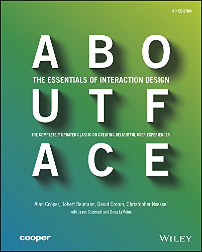
And no discussion on UX design goes online from me without a mention to the guru whose book About Face taught me that there is a thing like interaction design!

So let us, software people say once and for all that bad design is our public enemy no. 1. And we will get rid of it wherever we find it!


A software UX design story

This is a story taken from real life. One our customers from the Netherlands approached us with a very interesting idea of a software for gamifying trainings they run. They run trainings for big corporations - stuff like corporate policy, safe working habits, HR good practices, etc. The problem was that the topics were just not interesting enough to keep the attendees engaged. They needed something that would bring in more interest and engagement from the people attending the trainings. And their solution was to gamify the training sessions. They had rough outline of what would work in their heads but nothing in form of documentations. The big challenge thrown to us was capture all the ideas they had, pin them down to software features and also think of ways to make the software usable. This led to a requirements capture and UX design story I’m about to relate…


Chapter 1: Finding the need

We held multiple sessions with the clients and their presenters to gather information about their current working procedures and business needs and singled out the three major requirements:

postits.png
brainstorming.png

Chapter 2: Brainstorming

After multiple session of individual and group brainstorming on possibilities, we landed on the idea of developing a gamified presentation eco-system that would include 3 to 5 minutes of lectures or video presentations followed by pop quizzes about the current segment. The participants can engage with quiz live from their mobile device, competing with their peers, gaining points with the goal of being among the top scorer on a live leaderboard.

arrow.png

We came up with four major components

product concept.png

Some key concepts for the components were

Editor:
Create, configure and manage Shows
A show editor
Schedule, share and manage sessions

Projector:
Host's screen:  
* Initiate and navigating a session
Projector screen:
* Showing slides including presentation part and quiz part
* Live responses from users on quiz sessions
* A Live leader board.

Controller: 
A responsive and contextual version of the projected show
Interaction with the quiz slides
Questions, comments and feedback on a slide 

Auditor
View results of a session
Generate reports

arrow.png


Chapter 3: Personas, Use cases and Storyboarding

The next step in our design process was to identify the personas - the typical users of the system. This exercise was done mostly within the design team with a summary session with the customer to get their feedback - we had enough notes from our original brainstorming to identify the typical users of the system.

We then moved on to defining the various uses cases for each personas where we drew up how a persona would use the system to get their job done. For example: How Tom, Dick and Harry, with different personalities will access the show in their own ways.

Instead of just writing them down in spreadsheet or document, which is the standard practice, we decided to do a more graphical representation as this would aid in faster communication of the ideas.

persona.jpg


Chapter 4: Prototyping prototyping prototyping

Now that we had a solid idea about how the system would work, we moved on to building prototypes.

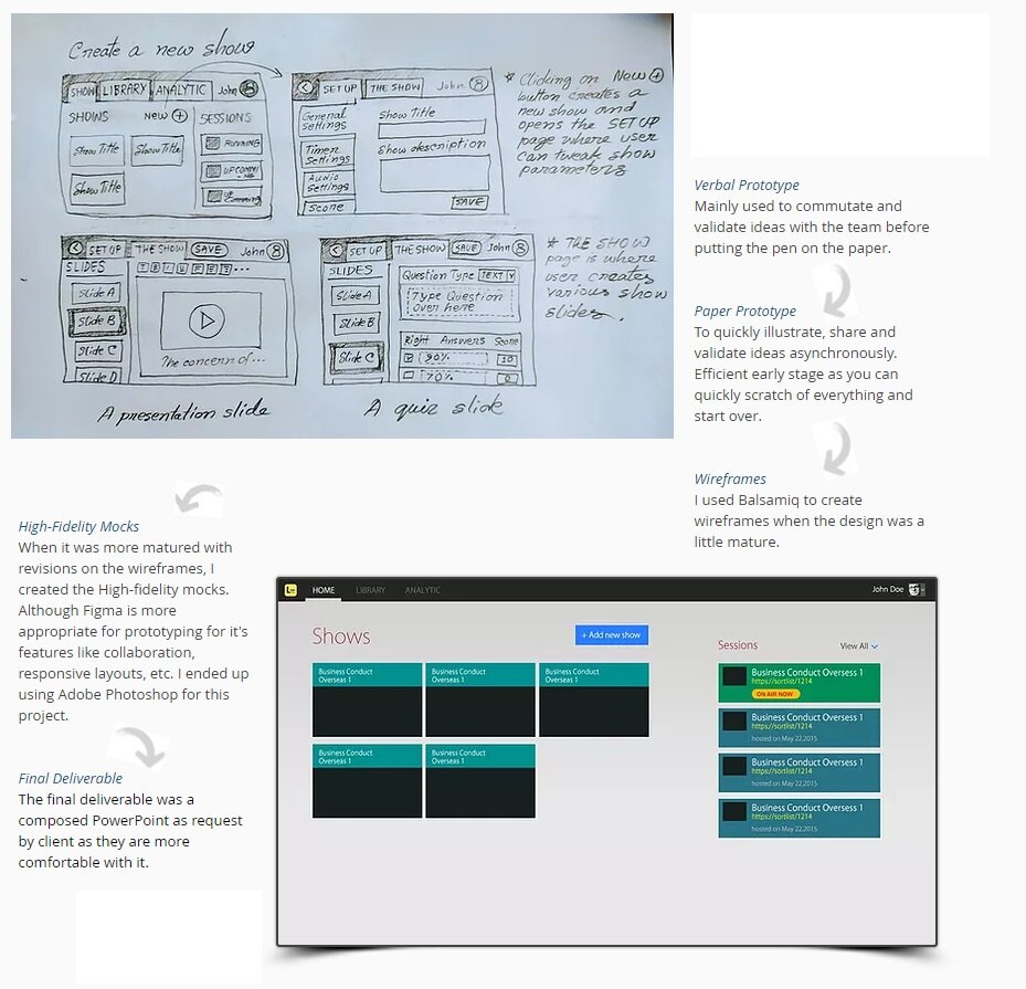
We started with horizontal prototyping capturing the global bird’s eye view of the whole system then vertical prototyping drilling down to specific features. Constantly evaluating and refining and gradually moving up from low-fidelity wireframes to a high-fidelity deliverable. 

prototyping.jpg
prototyping 2.jpg

Chapter 5: Evaluation and hand over to development

The prototypes helped us evaluate the product concept without a single line of code being written. We iterated over multiple version of the prototype by incorporating feedback from the customers and possible users of the system.

With the final version of the mockups done with a graphical prototype acting as a very clear spec document, the dev team moved in to develop the product but that's not the end of the design cycle. With feedback from real users and various stakeholder of the system, we had to to go through a few re-iteration of the design till all in the comfort zone that it was done right (enough).

Great story isn’t it?

Adapted from the original at: https://www.dpixelman.com/ by one the best man to lead our design team, Zahid, who has now moved on to newer things.

5 UX rule every software founder should know about

5 UX tips to impress anyone (1).png

I’ve found that in my chats with founders I keep coming to some common themes. And it doesn’t matter if the founder has been working on technology all his life or if he has no idea about software. One of those common themes is the discussion about how to make decisions about the actual user interface of the features that she has been dreaming up. For the technically minded founder it becomes a thing of do I use this pattern or that, or a strong bias of of some type (e.g. “less is more”, “pop ups are banned”, or something along those lines) and for the non technical founder it’s usually a more dangerous situation of absolute certainty about how the feature should be (usually with at least 20 buttons and a lot of color). The recurring theme follows a common script where we listen to the instructions, we try suggesting some changes and are met with strong opposition and sometimes dismay and we then suggest we draw this up (hoping that we might tweak things during that process). In most cases at some point we can convince the founder to have an open mind and make decisions about the user interface and interaction based on a rationale and sometimes also a debate. I used to point everyone to my favorite Alan Cooper’s About Face, it’s one of those books that equally valuable to the professionals as it’s to someone with a passing interest in UX. But now I find it easier to point to the amazing https://goodui.org/ as first step about thinking about patterns and rules of thumb in UI/UX (probably a sign that many of our new founders are from a generation that is more used to online content, quick reads and youtube).

Over the years, there are some UX wisdom that kind of made sense the moment we shared them with someone who didn’t know about them (or someone who knew but just haven’t thought about that for a while). These “instant hits” are really good to keep in mind when you are thinking about software interfaces but they are equally good to impress someone over a drink! So I thought it would be a good idea to do a quick and easy list of great UX wisdom today. Here’s my list of 5 of the easiest (and probably greatest too):

1. Fitt’s Law - larger and closer click-ability is better

Simple and logical rule of thumb which says you should always make the clickables (buttons, links, menus, etc.) large and close to where your mouse is currently. It’s so strong and has so much data to support it that it’s a “law” ! To implement Fitt’s law here are the two simple things you have to remember:

iphone.jpg
  • Most used UI elements should be on the edges of the screen. Because the cursor automatically stops at the edges, they will be easier to click on.

  • Make clickable areas as large as possible. Larger targets are easier to click on.

Fitt’s law is why tapping on those bigger commonly used buttons at the bottom of the iphone screen (where your thumb is) is so satisfying.


2. Hide your “ejector seat lever”

This one is from Alan Cooper. Again, very simple, you would never put the ejector seat lever button which ejects the pilot from a plane next to a common thing like light switch - just because accidents might happen. Same in software, don’t put major decision action elements (aka… buttons e.g.) next to and in similar level as other lesser ones. See how gmail keeps the trash option far away from the others and make the send button significantly different it’s neighbors? Great job.

gmail.png

Here’s the section from the man himself. If you haven’t got this book, buy it, if you have anything to do with software you should treat this as your religious text.

ejector lever.png
About Face: The Essentials of Interaction Design
By Alan Cooper, Robert Reimann, David Cronin, Christopher Noessel

3. Fewer is always better

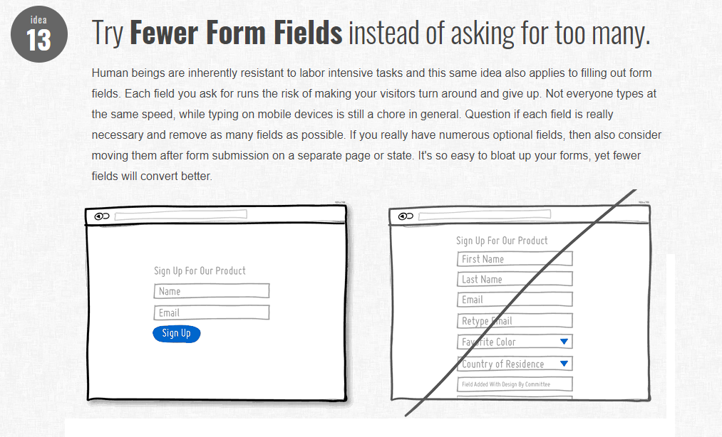
Not sure if there is “pattern” with that exact wording, but there are many patterns and rules of thumb that can be distilled into this simple rule of thumb. The rule is just what it says, if you have an option between two sets of UI both of which gets the job done then the better one is the one with fewer elements, fewer actions, fewer buttons, fewer picture, fewer .. ok you get my point. You’ll find many versions of this rule, say if for a form GoodUI just has it as idea #13

This is why Google’s insanely simple home page for search was and is still the winner.


4. Progressive disclosure

Sounds fancy but all this is saying is that you should not show all your features to the user in one go and overwhelm him. Just delay displaying advanced or rarely used features, push them secondary screens, this will make your software easier to learn and keep your users engaged.

By hiding complex things, you are making the initial interfaces clutter free. You are also giving the user the time to learn your software, get small dopamine hits of success as they successfully use the software to get their job done. For some of the features there might be no other way but to get the user to do all the screens, but use this pattern to just split it up and show the screens in steps - keeping the user happy and engaged. The goal is to show only essential information. Then get the users to take the next step. When the user completes a step, reveal the information in that new step, keeping current state visible. By keeping previous steps, users can change what they have put in. Here’s a much more detailed version of this pattern.

5. A clear primary action for every interface

Every interface you build must have a single action that it wants the user to accomplish - the primary action. Focusing on splitting the interfaces up so that they don’t offer a multitude of actions each leading to a new path saves the user from confusion and the complex task of remember where they are within your software. The primary action button (or element) should focused, highlighted and obvious. All the wording, graphics of that interface should support that single primary action.

gmail compose.png

If the interface is for submitting generating an invoice, there should a big highlighted button called “Generate Invoice” for example. Well, life isn’t always that clear cut, but you’ll find that you can always find a solution that pays respect to this single (or at least clear) primary action. And this makes the interface so much easier to use. Something as complex as gmail’s logged in home screen, that probably has at least 100 clickable elements and action item can still offer that primary action feel. Almost the first thing you notice is that significantly different Compose button that’s inviting you to click it.


"VIVE Vibe" - making the first VR game

As with the rest of the software world we were excited about the possibilities of VR and getting our hands dirty with some VR code. So it was with a big smile on our face that we took in our first official VR project. And not just any boring "also ran" VR app but a full blown first person shooting game!

vive.jpeg

Nothing compares to writing a game. Add to that the total immersive environment of a HTC VIVE (our first target platform) you have something that literally stops us from living in the reality of this world :)

I'll be writing here about our experiences in this first serious dabble in the world of VR. Here are somethings that we wish we knew from the beginning...


Virtual reality is a whole new ball game

Duh! That should be obvious. But if you think about a software company that has been around for 14 years, you'll realize that we are a group of people that has seen really wide range of technical innovations. So we just assumed (the wort possible word in our profession - as we learned once again) that most of our experience would translate to this new platform. We soon realized that although coding skills (e.g. Unity or C# skills) translate pretty well but as soon as you hit anything Ux be it GUI, interactions or usability you have to learn everything from scratch. The total immersion of VR and the closeness of that experience of that with everyday human experience leads to a complete rethinking of how the software should interact with the user. Mr. Cooper, a new About face is sorely needed.

Interfaces are your friend

I mean the Interface constructs the programming languages. VR hardware is still at infancy. Just like every other hardware race, several companies are fighting it out with their own set of hardware, SDKs and way of doing things (mostly bugs :) ). So the code you write needs to have a way to be abstracted easily so that you add new hardware support without rewriting the core game logic. And that's where all those OOP skills will come in handy. A simple rule we use is to keep asking "what if I switched to Rift here?" and that helps give perspective. So go for all the IPlayer, IScorePack, Ix you can think of!

Get early feedback

OK this is really ancient advice in software, but we felt that in VR software this is even more true than other spaces. Again, because of the closeness to everyday human experience and the immersion in a VR application (particularly a game with realistic graphics) it's very easy for users to assume they know exactly how (and where) things should be. Gone are the old escape routes that techies used to take like "Windows has their Cancel buttons there" or "right click is always context menu". As soon as we got our first broken version out we found that even team members were complaining about how a certain thing was being picked up or how a door was being opened. And it's obvious, these are things we have learned over years of real experience, there is a universally accepted convention out there for basic things like "picking up an object" and you cannot mess with it! So schedule demos at every point of the project, run usability sessions, even better run Joel's hallway tests at every opportunity you get. 

OK on that note let me leave with some of our "hallway tests" put together in a little video by our design guru.

I'll be sharing more of our VR development experience here, so watch this space!

The Art and Science of Website Design

One day whilst at a museum showcasing art by a very famous artist a 7 year old boy stood in front of a painting showing a single brown dot, a blue sinuous line and nothing else. The painting was apparently of a woman sitting by the riverside. The child turns to his parents and says “hey you know I could draw that” much to the laughter of the surrounding patrons. Then what exactly made this painting by such a famous artist so special? Was it the simplicity of subject, idea and form? It was design.

Design is all around us whether natural or man-made. We always try to differentiate something by comparing designs. Whether it is a simple cellphone, a piece of furniture, the home we live in, the food we present and eat, anything we do has aspects of design incorporated in to it. So when it comes to a website that is actually our way of declaring “hey I am here this is me” design plays a pivotal role in capturing the attention of our intended audience as well as communicating your message.

Website design is an art and a science. Why? Well if you look at the millions of websites on the internet all vying for attention it is easy to realize why so much effort is placed into design. Starting from statistics, consumer behavior, psychology etc. elaborate attention to what processes get the largest audience and readership have become a science for website design. If we look from a different perspective attractive websites are no longer simple pictures or texts jumbled together, they contain audio, video, stunning images, and are increasingly interactive all making website design an art.

“To Be Or Not to Be” A Great Website:

So how do we design a great website? Well the first thing to think about while designing your website is what you want to communicate and who you want to communicate that too. That is targeting your audience with the right message. Most people will not spend a lot of time on a website browsing through material so it is important to keep your message concise. Think in terms of branding how do you want your audience to remember you and design your website accordingly. List out the main things that you do or want to express, make sure you do not drift from your main functions as this will dilute any message you wish to convey.


“Emotions Are Good” for Website Design:

Good websites are designed to have a personality of their own. It may have humor, be serious but it should invoke in the visitor some kind of emotional response. Employing images, animations, audio or video can easily grab and retain the attention of the audience as well as make it more attractive at an emotional level. Websites with images of faces and people also help to make your visitor feel more at home using sentimentality gives your website a much more personal appeal.  Check out the Moto G Website


Simplicity Equals to Sophistication

A great way to really loose the attention of a visitor to your site would be to cram it full of needless information and have a cluttered design that would quickly exasperate any visitor as they tried to navigate the site. Often the simplest designs are the most attractive so don’t go overboard by adding too many elements to your website. Clean designs are something Apple does very well 


Interactive Website Design

People love to interact with their environment. Adding interactive elements to your website increases its appeal significantly. The user experience becomes more personal leading to a richer more memorable experience for the visitor. Adding elements like sound, or other audio visual stimuli that appeal to one or more of the human senses lead to a positive experience for any visitor. Keeping the visitor involved doing something on your website means that they are bound to spend much more time going through it. Here is a good example... try out their fidgety menu bar!  http://rog.ie/

The People and Process of Website Design

Bringing together the multifarious elements of designing a website can be a daunting task. That is why it is important to have a team who know exactly what needs to be done to get your website up and running. The team should be able to cover all aspects of website design including coding, art, prototyping, customization, testing and validation (etc.) just to name a few.  The ability of a team to create responsive designs, inspirational outlooks and looking at issues from a different perspective all contribute to the designing of a great website.

That is why we at KAZ software have the some of the most experienced professionals from diverse backgrounds dedicated to give you the best website you can have.